
Case study — 01
Drone Mission
Control Dashboard
A complex operational system for UAV fleet command. Structuring situational awareness, critical alert management, and decision support for high-stakes environments.
A complex operational system for UAV fleet command. Structuring situational awareness, critical alert management, and decision support for high-stakes environments.
ASELSAN UAV operators manage 2–4 active drones simultaneously from ground control stations during time-critical reconnaissance and surveillance missions. The core problem is broken situational awareness: operators rely on fragmented software tools — separate applications for telemetry, mission planning, and alert management — that force constant context-switching between screens.
Situational awareness, as defined by Mica Endsley's three-level model, requires simultaneous perception of system state, comprehension of what that state means, and projection of what will happen next. The fragmented tool setup destroys all three levels at once. An operator cannot perceive the full fleet while focused on one drone's telemetry window, cannot comprehend a battery warning without switching tools to check remaining flight time, and cannot project consequences while manually navigating between disconnected interfaces.
This is not a usability problem in the consumer sense. The operational environment introduces three factors that make poor interface design consequential rather than merely inconvenient: time pressure (anomalies escalate in seconds, not minutes), irreversibility (a missed critical alert cannot be undone after a drone loses power or crashes), and sustained cognitive load (operators work 6–8 hour shifts during which fatigue compounds every design flaw).
In this context, information hierarchy is not a design preference — it is a safety mechanism. What the operator sees first, what requires a click to discover, and what is buried behind navigation determines whether critical events get actioned or missed. Every layer of hierarchy added to the interface is a layer of delay added to the response.
How do we design a mission control system that maintains full situational awareness across a multi-drone fleet, surfaces critical alerts as decision prompts rather than failure notifications, and reduces extraneous cognitive load — so operators spend mental capacity on judgment, not interface navigation?
Direct access to ASELSAN operators is not possible — UAV ground control operations are classified environments. I built the research base from four sources: human factors and cognitive science literature specific to operational systems, analogous domain analysis of comparable high-stakes environments (NASA mission control, air traffic control, emergency dispatch), published post-incident reviews of UAV GCS interface failures, and military display standards that encode decades of operational HMI research.
The analytical frame throughout was the same: what cognitive demands does this environment place on operators, where do those demands exceed what the current interface supports, and what design decisions have empirically reduced error in comparable high-stakes contexts? I was not looking for features — I was looking for the cognitive failure modes the interface must prevent.
| Source | Method | Relevance to this design |
|---|---|---|
| Endsley, 1995 — Situational Awareness Theory | Cognitive science | Defines three levels of SA (perception → comprehension → projection) that the interface must support simultaneously. Directly shaped the dashboard's information hierarchy — what is always visible versus what requires navigation. |
| Wickens, 2002 — Multiple Resource Theory | Human factors | Explains why attention narrows under high cognitive load and why visual competition between interface zones causes missed signals. Informed the decision to separate alerts into a dedicated persistent panel rather than overlaying the map. |
| NASA Mission Control interface audits | Analogous domain | How real-time status boards maintain fleet-level awareness without requiring navigation. The persistent fleet strip concept derives directly from this pattern. |
| Air traffic control HMI standards (ICAO Doc 9758) | Standards review | Alert tier classification, redundant state signalling (color + icon + label), and the principle that alerts must prescribe action, not merely report events. Core to the decision support model in this system. |
| MIL-STD-1472 — Human Engineering Design Criteria | Military standard | Minimum legibility requirements for operational displays, low-light contrast standards, and cognitive load limits for sustained-attention tasks. Set the floor for typography sizing and contrast ratios. |
| Published UAV GCS post-incident reviews | Secondary research | Recurring failure pattern: operators missed critical battery and signal alerts because they were positioned outside the primary visual field during map-monitoring tasks. Directly drove the alert panel placement decision. |
I reviewed publicly available screenshots and documentation for three comparable GCS systems: DJI FlightHub, Autel Enterprise, and open-source UgCS. My focus was not on feature parity but on how each system handles simultaneous drone management and alert escalation — the two most critical use cases for ASELSAN operators.
Key observation: all three systems default to a sequential mental model — you monitor drone one, then switch to drone two. None provide a persistent fleet-level overview that allows the operator to see all vehicles simultaneously without navigation. This was the clearest gap to address.
Every time an operator navigates between tools, they lose Level 1 SA (perception of fleet state) for the vehicles not currently on screen. Endsley's research shows that SA loss is the primary precursor to error in high-stakes control environments — not lack of skill or training.
In ATC and dispatch research, alerts that describe what went wrong without specifying what to do next introduce a secondary cognitive task at exactly the wrong moment. The operator must diagnose and decide simultaneously — under time pressure. Decision support collapses that into a single prompt.
Where information appears on screen determines how quickly it reaches the operator. Fleet status buried in a secondary view is not "available" — it is effectively invisible during a critical event. Persistent, always-visible status is the only reliable design pattern for operational systems.
Sweller's Cognitive Load Theory distinguishes between intrinsic load (the complexity of the task itself) and extraneous load (complexity introduced by poor design). Operators cannot reduce intrinsic load — managing three drones is genuinely complex. But extraneous load from fragmented tools, unclear states, and unintuitive navigation is entirely the interface's responsibility to eliminate.
From the research, two distinct user types emerged with different goals, session lengths, and definitions of success. I kept both in frame throughout the design process — the operator's needs drove the real-time interface, while the planner's needs shaped the mission planning module.

Monitors 2–4 active drones during reconnaissance missions. Works in a darkened command vehicle, 6-hour shifts. Currently switches between three separate software tools during active operations.

Plans missions 24–48 hours in advance at HQ. Defines waypoints, altitude corridors and contingency routes. Reviews post-mission telemetry for after-action reports.
Before drawing any screens I defined what information belongs at each level of hierarchy — what is always visible, what is one click away, and what requires deliberate navigation. This decision determines response time more than any visual design choice. In operational systems, information hierarchy is not aesthetic — it is a latency specification.
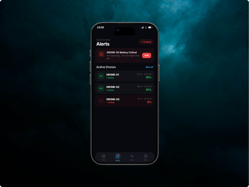
Level 1 — Always visible (zero clicks): fleet status for all drones, active critical alerts, map position. An operator should never need to act to see these. They must be in peripheral vision at all times.
Level 2 — Immediate access (one click): full alert detail with recommended action, per-drone telemetry deep-dive, mission route status. The operator chooses to focus here when a Level 1 signal demands it.
Level 3 — Deliberate navigation: mission planning, historical telemetry, alert configuration, system settings. These are planning and review tasks — never needed during active operations, so the cost of navigation is acceptable.
This hierarchy maps directly to Endsley's SA levels: Level 1 supports perception, Level 2 supports comprehension, Level 3 supports projection and planning. Every IA decision in this project was evaluated against one question: does this placement break an operator's ability to maintain awareness at the level above it?
Focused sitemap — four operational modules, one settings area. Navigation depth kept to two levels maximum.
Critical alert response — maximum 3 actions from alert appearance to command execution.
With limited time and a clear operational brief, I ran a simple MoSCoW prioritisation against the user needs identified in Section 03. This kept the design focused on what operators actually need during active missions, rather than what might be useful eventually.
| Feature | Priority | Rationale |
|---|---|---|
| Persistent fleet status strip | Must have | Core insight: operators cannot navigate to each drone individually during active missions |
| Three-tier alert system with action prompts | Must have | Directly addresses the "alerts describe failure, not action" pain point |
| Map-based mission planning | Must have | Spatial context is essential for route design — coordinate-entry alternatives are too slow |
| Automated route validation | Should have | Reduces planner workload significantly; manual validation is error-prone under time pressure |
| Telemetry graphs (historical) | Should have | Useful for post-mission review; not critical during active operations |
| Multi-operator coordination | Could have | High value but high complexity; appropriate for a V2 after validating single-operator flows |
| Automated mission replanning (AI) | Won't have | Requires trust calibration and human-in-the-loop protocols beyond scope of this project |
I mapped the most important flow in detail — what happens when a critical alert fires during an active mission. This flow drove the placement of every alert-related component in the dashboard. If an operator has to take more than three actions to resolve or acknowledge a critical event, the interface has failed.
Before committing to any layout, I sketched three fundamentally different approaches to the dashboard. Each prioritised different information differently, and each had a real tradeoff. The goal was to stress-test the IA before building anything.
One drone fills the entire screen with full telemetry data. Operators navigate between drones. Rejected because it replicates the existing fragmentation problem — you cannot monitor other vehicles while focused on one, which is exactly the behaviour we identified as causing missed alerts.
Each drone occupies an equal-sized panel on screen. Scales poorly — 4 drones is manageable, but 6 makes each panel too small to read. Also lacks a shared spatial context (the map), which research showed is essential for decision-making. Operators need to know where drones are, not just their status numbers.
Map dominates the center — operators always know spatial positions. Alerts appear in a fixed right panel, never overlaying the map. Fleet status persists in a bottom strip, visible from every screen. This respects the operator's need for simultaneous awareness while providing a clear spatial anchor.
These wireframes were the first fidelity at which the layout concepts became concrete. They were deliberately rough — the goal was to test the structure, not the aesthetics. Each screen was tested against the critical user flows defined in Section 04.
The final solution is not a dashboard — it is an operational system structured around how operators maintain situational awareness, form decisions, and take action under sustained cognitive load. Four screens, each answering a different cognitive question: What is the current state of the fleet? (Dashboard) Where are we going and is the route safe? (Planning) How is each individual vehicle actually performing? (Telemetry) What requires my attention and what should I do about it? (Alerts).
The design keeps the operator in the dashboard for the majority of active mission time. Every other screen is a deliberate departure — one that temporarily reduces fleet-level SA for a specific reason — which means each must justify that cost. Navigation between screens is an exception, not a workflow.
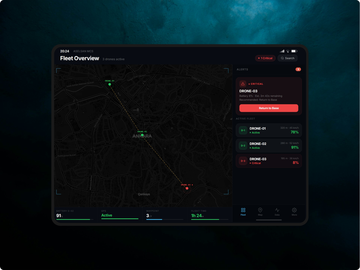
Map-centric with persistent fleet strip. Operator sees all drones, all positions, and all alerts without navigation.
Map-based waypoint editor with inline automated validation. Draft vs approved states are visually explicit.
Three-tier severity system with inline action buttons. Critical alerts cannot be dismissed for 3 seconds — long enough to read the context.
Flight data, power system, signal quality and payload status in one view. Battery bar interpolates color from green through amber to red.
Every visual decision in this system is an operational decision. The design language exists to reduce extraneous cognitive load — the kind Sweller's theory identifies as entirely the system's responsibility to eliminate. Operators should spend mental capacity on judgment, not on decoding the interface.
Dark terminal theme: operators work in low-light command environments for 6–8 hour shifts. A bright interface in a dark room creates sustained pupil dilation contrast that causes cumulative eye fatigue — measurably degrading attention in the latter half of long sessions. The dark background is an endurance design decision, not a stylistic one.
Green and amber accent system: these map to universal instrument panel convention — green for nominal, amber for caution — because leveraging existing mental models removes the need for operators to learn new colour semantics. Crucially, both colours are distinguishable by the most common forms of colour blindness, and every state is redundantly confirmed by icon and label. No operator should ever have to ask "what does this colour mean?"
IBM Plex Mono for all data values: monospaced numerals maintain fixed column widths as telemetry values update in real time. Without this, a battery reading changing from 100% to 8% shifts surrounding layout — introducing a visual disturbance that pulls attention at exactly the moment the operator should be reading the value. Stability in the visual field is a cognitive load management technique, not a typographic preference.
Single font family for UI text: dense operational interfaces are harmed by display/body pairings. The typographic contrast that signals premium brand quality in a marketing context introduces visual noise in a data-dense dashboard — the eye registers the type shift as a hierarchy signal when the hierarchy is already being communicated by size, weight, and position. One family, tightly controlled, preserves the hierarchy for information, not aesthetics.
| Decision | Rationale |
|---|---|
| Dark terminal theme | Operators work in low-light environments; dark UI reduces eye strain across 6–8 hour shifts. Ambient light contrast favors dark backgrounds in controlled settings. |
| Green + amber accent palette | Universal instrument-panel language. Both colors pass contrast checks for the most common color blindness variants. Never used as sole status indicators. |
| IBM Plex Mono for data values | Tabular numerals prevent layout shift as telemetry values update in real-time. Critical for readability during active monitoring. |
| Alerts inline, no modal | Modals cover the map — the information the operator needs to make the decision the alert is asking for. Inline actions preserve spatial context. |
| Status = color + icon + label | WCAG 1.4.1: never use color as the sole differentiator. Operators with color blindness must be able to use this system without accommodation. |
| Fleet strip persists across all screens | Research finding: operators must never lose awareness of inactive drones while focused on one. The strip is the system's memory; the operator uses working memory for decisions. |
I could not access ASELSAN operators directly, so I conducted three think-aloud sessions with analogous domain professionals — a private aircraft pilot, a logistics dispatcher managing real-time vehicle routing, and an IT operations engineer who monitors multi-server infrastructure dashboards. All three work in environments with similar cognitive demands: multiple simultaneous streams of status information, time-critical decision-making, and consequences for missing alerts.
Participants were given three scenarios to complete using the prototype:
Two of three participants responded to the DRONE-03 critical alert immediately — without being prompted — within 8 seconds of seeing the dashboard. The third participant noticed the alert within 20 seconds, after spending time orienting to the interface. The alert pulsing animation was cited by all three as the key attractor.
The third scenario — describing all drone statuses without navigating — was completed successfully by all participants, confirming that the fleet strip accomplishes its core goal.
Each testing finding translated into a specific, scoped change. I deliberately avoided over-correcting — testing surfaces symptoms, and good iteration addresses root causes rather than symptoms. Below are the three most significant changes and the reasoning behind each.
Alert showed severity badge, then 2–3 lines of contextual description, then the recommended action and buttons at the bottom. Logical reading order — but the decision support was buried behind diagnosis.
Recommended action promoted immediately below the alert headline at larger type size. Description becomes secondary. Operator reaches the decision prompt in the first visual fixation — reducing time-to-action by removing one cognitive step.
Rationale: the original design reflected an information-first mental model — give context, then offer action. Testing revealed this is wrong for high-stakes environments. Operators in time-critical situations do not need to understand before they act; they need to act correctly and understand later. The description remains visible for logging and situational comprehension, but it no longer gates the decision path.
Validation results appeared as a list below the waypoint editor in the right panel. On a shorter viewport, the list was below the visible area and required scrolling to see failures.
A sticky strip at the top of the right panel shows current validation status at all times. When there are failures, it turns amber/red and expands. The Approve button remains disabled until all failures resolve.
Rationale: critical system errors must not require scrolling to discover. The Approve button being disabled is not sufficient — operators should understand why it is disabled without hunting for the reason.
Metric labels (ALT, SPD, BAT) were 9px — technically legible on the primary monitor but reported as difficult to read at distance. The values themselves were readable but the labels did not provide enough contrast.
Labels increased to 11px and shifted from oklch(0.38) to oklch(0.52) — still clearly secondary but legible at arm's length. Values increased to 1rem minimum for the most critical metrics (battery, altitude).
Rationale: defense hardware is often deployed in non-ideal viewing conditions. MIL-STD-1472 recommends minimum 12pt for operational displays — I had drifted below this threshold in the interest of fitting more data, which was the wrong tradeoff.
This project pushed me to think about design in a register I had not worked in before — where the stakes of a bad interface decision are operational, not reputational. That framing changed everything about how I approached tradeoffs. I was much less willing to sacrifice clarity for aesthetics, and much more disciplined about asking "what happens if the operator misses this?" rather than "does this look clean?"
Designing for high-stakes operational environments reframes every design decision. Situational awareness is not a feature — it is the baseline the entire system must protect. Information hierarchy is not organisation — it is a response-time specification. And cognitive load is not a user experience concern — it is a safety variable. The moment an operator has to think about the interface, it has already failed them.